IgrGrid ではテンプレート機能を使用してセルにカスタムの要素を配置することができます。
セルが非編集時に使用されるのがセルテンプレート( bodyTemplate )、編集モード時に使用されるのがセル編集テンプレート( inlineEditorTemplate )です。
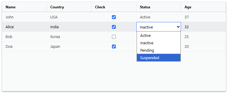
ここでは、セルにチェックボックス( <input type=checkbox> )とセレクトボックス( <select> )を表示するサンプルを作成します。以下のように、「check」列と「status」列を定義し、それぞれに bodyTemplate と inlineEditorTemplate プロパティを設定します。
<IgrGrid ..... >
	<IgrColumn
	  field="check"
	  header="Check"
	  cellClasses={checkboxDisplayClasses}
	  editable={true}
	  bodyTemplate={checkBoxTemplate}
	  inlineEditorTemplate={editCheckBoxTemplate}
	></IgrColumn>
	<IgrColumn
	  field="status"
	  header="Status"
	  editable={true}
	  bodyTemplate={comboCellTemplate}
	  inlineEditorTemplate={editComboTemplate}
	></IgrColumn>
.....
</IgrGrid>
チェックボックスセルの非編集時のテンプレートである checkBoxTemplate 、編集モード時のテンプレート editCheckBoxTemplate 、セレクトボックスセルの非編集時のテンプレート comboCellTemplate 、編集モード時のテンプレート editComboTemplate は以下のようにファンクションを作成します。
// チェックボックス表示用テンプレート
const checkBoxTemplate = (ctx: IgrCellTemplateContext) => {
  const handleChange = (event: React.ChangeEvent<HTMLInputElement>) => {
    ctx.cell.value = event.target.checked;
  };
  return (
      <span>
          <input
          type="checkbox"
          checked={ctx.cell.value}
          onChange={handleChange}
        />
      </span>
  );
};

// チェックボックス編集用テンプレート
const editCheckBoxTemplate = (ctx: IgrCellTemplateContext) => {
  const handleChange = (event: React.ChangeEvent<HTMLInputElement>) => {
    ctx.cell.editValue = event.target.checked;
  };

  return (
    <initial-focus>
      <span>
          <input
          type="checkbox"
          defaultChecked={ctx.cell.value}
          onChange={handleChange}
        />
      </span>
    </initial-focus>
  );
};

// セレクトボックス表示用テンプレート
const comboCellTemplate = (ctx: IgrCellTemplateContext) => {
  return <span>{ctx.cell.value}</span>;
};

// セレクトボックス編集用テンプレート
const editComboTemplate = (ctx: IgrCellTemplateContext) => {
  const handleChange = (event: React.ChangeEvent<HTMLSelectElement>) => {
    ctx.cell.editValue = event.target.value;
  };

  return (
    <initial-focus>
      <select
      defaultValue={ctx.cell.value}
      onChange={handleChange}
      className="editor-template">
        {statusOptions.map((option) => (
          <option key={option} value={option}>
            {option}
          </option>
        ))}
      </select>
    </initial-focus>
  );
};
上の実装で、editCheckBoxTemplate と editComboTemplate 内の <input> および <select> タグは、 <initial-focus> タグで囲まれています。これは、セルが編集モードに入った際にこれらの要素にフォーカスを当てる処理を行うためです。この処理により、タブキー等でセルの遷移をしながらキーボード操作によってセルを編集することが可能になります。
<initial-focus> タグを使用するためのInitialFocusクラスは以下のように定義します。
declare module "react/jsx-runtime" {
  namespace JSX {
    interface IntrinsicElements {
      "initial-focus": React.DetailedHTMLProps<React.HTMLAttributes<HTMLElement>, HTMLElement>;
    }
  }
}

let mouseX = 0;
let mouseY = 0;
let mouseLeftDown = false;

// ポインターデバイス位置を追跡
document.addEventListener('pointermove', (e) => {
  mouseX = e.clientX;
  mouseY = e.clientY;
});

// ポインターデバイスの左ボタンの押下状態を追跡
document.addEventListener('pointerdown', (e) => {
  if (e.button === 0) mouseLeftDown = true;
});

document.addEventListener('pointerup', (e) => {
  if (e.button === 0) mouseLeftDown = false;
});

// 要素がポインターデバイス下にあるか判定
function isElementUnderCursor(element: HTMLElement): boolean {
  const rect = element.getBoundingClientRect();
  return (
    mouseX >= rect.left &&
    mouseX <= rect.right &&
    mouseY >= rect.top &&
    mouseY <= rect.bottom
  );
}

class InitialFocus extends HTMLElement {
  constructor() { super(); }
  connectedCallback() {
    setTimeout(() => {
      const input = this.querySelector('input,select');
      if (!input || !(input instanceof HTMLElement)) return;

      // 初期フォーカスおよび選択状態の設定
      input.focus();
      (input instanceof HTMLInputElement || input instanceof HTMLTextAreaElement) && input.select();

      // ポインターデバイスの左ボタンが押下された状態で要素がカーソル下にある場合、
      // 左ボタンの解放のタイミングでクリックイベントおよびピッカー表示を発生させる
      if (isElementUnderCursor(input) && mouseLeftDown) {
        const handler = () => {
          if (!isElementUnderCursor(input)) return;
          input.click();
          (input instanceof HTMLSelectElement) && input.showPicker();
        };
        document.addEventListener('pointerup', handler, { once: true });
      }
    }, 0);
  }
}
customElements.define('initial-focus', InitialFocus);