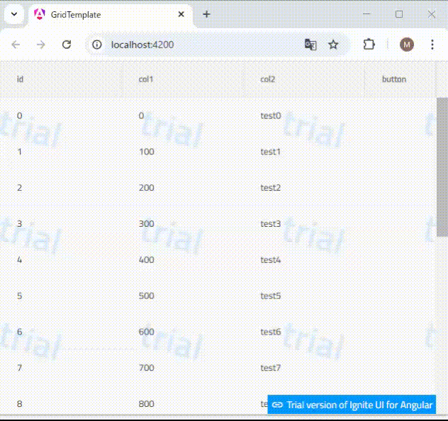
igxGridのセルテンプレート機能を使用してセルにボタンを配置し、cssによって表示を行のホバー時に限定することができます。
以下の例では「col3」列にテンプレートを設定し、ボタンを配置しています。
<igx-grid [data]="data" [autoGenerate]="false" height="500px" width="100%">
  <igx-column [field]="'id'"></igx-column>
  <igx-column [field]="'col1'"></igx-column>
  <igx-column [field]="'col2'"></igx-column>
  <igx-column [field]="'col3'" header="button" width="100px">
    <ng-template igxCell let-value let-cell="cell">
      <button class="myButton" (click)="testClick($event, cell)">test</button>
    </ng-template></igx-column>
</igx-grid>
cssを以下のように設定します。
.myButton {
  display: none;
}

igx-grid-row:hover .myButton {
  display: inline-block;
}