この KB は 製品バージョン 11.1.7 をベースにしています。
下記ナレッジベースに類似するシナリオですが、セルの値に応じて異なるスタイルを適用する方法をご紹介します。
IgxGrid 条件に応じてセルにスタイルを適用する – INFRAGISTICS ナレッジベース
上記ナレッジベースと同様に cellClasses プロパティを利用しますが、cellClasses プロパティには複数のスタイルを含むオブジェクトをバインド致します。
app.component.html
<igx-grid #grid1
  [data]="data"
  [primaryKey]="'ID'"
  [width]="'917px'" [height]="'334px'"
  [displayDensity]="'compact'">
    <igx-column *ngFor="let c of columns"
          [field]="c.field"
          [header]="c.headerText"
          [width]="c.width"
          [resizable]="c.resizable"
          [pinned]="c.pinned"
          [sortable]="true"
          [movable]="true"
          [editable]="true"
          [cellClasses] = "c.classes ? cellTextClasses : null">
    </igx-column>
</igx-grid>
app.component.ts
  cellTextClasses = {
    low: (rowData, columnKey, cellValue, rowIndex) => {
      return rowData[columnKey] < 10;
    },
    high: (rowData, columnKey, cellValue, rowIndex) => {
      return rowData[columnKey] > 50;
    }
  };
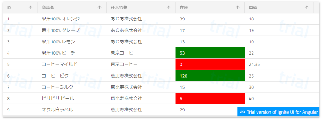
実行結果
値に応じて異なるスタイルを適用することができました。(「在庫」列で 10 未満の場合は赤色、51 以上の場合はみどり色を配色します。)