igxDatePicker は テーマを上書きすることで見た目を変更することができます。
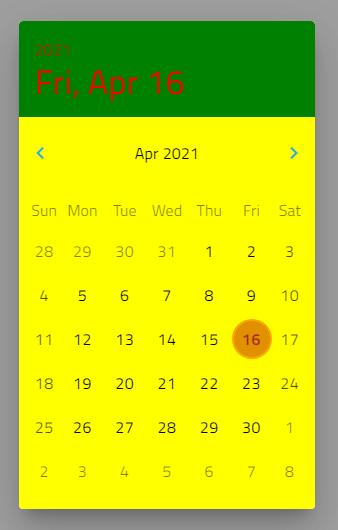
$custom-datepicker-theme: igx-calendar-theme(
  // カレンダーヘッダーの背景色
    $header-background: green,
  // カレンダーヘッダーの文字色
    $header-text-color: red,
  // igx-calendar-picker の背景色
    $picker-background-color: yellow,
  // カレンダーコンテンツの背景色
    $content-background: yellow,
  // 本日の文字色
    $date-current-text-color: brown,
  // 本日の背景色
    $date-current-bg-color: orange,
  // 次月、前月の矢印部分の色
    $picker-arrow-color: #2dabe8,
  // 選択日付の文字色
    $date-selected-text-color: orange,
  // 今年/選択された年のテキストの色。
    $year-current-text-color: #2dabe8,
  // 今月/選択された月のテキストの色。
    $month-current-text-color: #2dabe8
);

:host ::ng-deep {
  @include igx-calendar($custom-datepicker-theme);
}
上記以外のプロパティもご用意しています。詳細は下記リンクをご参考ください。